
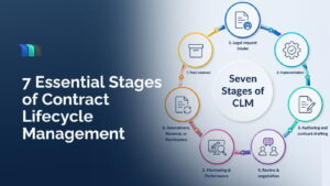
7 Essential Stages of the Contract Lifecycle Management Process
Key Takeaways For businesses and enterprises, contracts make up more than half of the operations. Be it vendor agreements, client
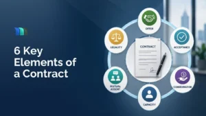
What Are the Elements of a Contract? A Practical Guide for Legal Departments
Every contract, no matter how long or complex, is built on the same foundation. A multi-billion-dollar M&A agreement and a
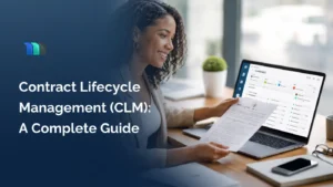
Contract Lifecycle Management (CLM): Complete Guide for In-house Legal Teams
Quick Summary Every business runs on contracts, and yet most of them have no consistent process for managing them, leading
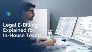
Legal E-Billing Explained for In-House Teams
Outside counsel relationships are built on trust. But when billing is inconsistent, invoices are disputed, and payments are delayed, that

How In-House Teams Can Reduce Outside Counsel Spend
In-house teams are handed a smaller budget than the previous year, every year, along with a long list of priorities.
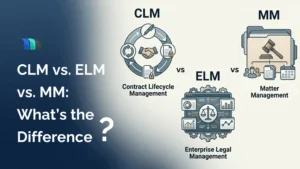
CLM vs ELM vs Matter Management (MM): What’s the Difference? (Complete 2026 Guide)
As a legal professional researching good legal software, you must have run into acronyms that seem to overlap: CLM, ELM,

How to Choose In-House Legal Software Without Overpaying or Overbuying
In-house counsel teams face growing pressure in 2026. Fast-growing companies flood legal departments with more contracts, litigation, and compliance tasks.
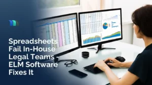
Why Spreadsheets Fail In-House Legal Teams and How ELM Software Fixes It in 2026
Introduction: A Hidden Crisis in Corporate Legal Departments How would you feel if your general counsel had to scroll through

6 Essential Tech Stacks and Tools for In-House Counsel and Legal Operations
Legal teams today operate at the centre of business decision-making. They manage contracts, oversee compliance, handle disputes, and support growth
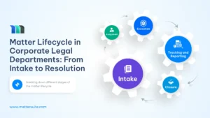
Matter Lifecycle in Corporate Legal Departments: From Intake to Resolution
The process of how a matter moves from one standpoint to the next is the matter lifecycle. It involves capturing
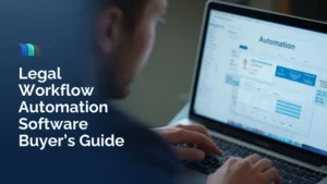
Legal Workflow Management Software: Complete Guide for Law Departments
Legal workflow management software used to be something only big firms talked about, but really, it was only a matter
Why Legal Intake Software Is Becoming Essential for Corporate Law Departments?
The Digital Shift in Corporate Legal Departments Corporate law departments today operate in a fast-paced environment where inquiries arrive from

The Future of Legal Matter Management: AI, Automation & Beyond
It was only a few years ago when you sustain operations using shared drives and email threads. But the volume

The Advantages of Virtual Legal Assistants for Law Offices
The world is going digital, and law offices are not so far behind. From virtual courts to virtual offices, the
What Is a Legal Matter, and How Is It Defined in Law?
What is a legal matter? Legal work is an essential part of every firm. A legal matter, in simple terms,

How Medical Lawsuit Lawyers Make Sense of Medical Records
If you’re preparing for a medical lawsuit case, the stack of medical records can be absolutely tedious and time-consuming. There

How Lawyers Can Help Clients Document Injuries for Maximum Compensation
Most clients don’t think like lawyers in the moments after an injury. They don’t notice the lighting. They don’t check

Stop Paying for AI. Start Winning Cases with It.
If you’ve been following legal tech headlines, you’ve seen the buzz: “AI is the future of law!” “Revolutionize your practice